I've done some very extensive comparison of v1 and v2. The plots below are included in the current BGPS draft, but I'll go into more excessive detail here. ALL plots below show Version 1 fluxes versus Version 2 fluxes using Bolocat V1 apertures. This means there are only two possible effects in play:
- Different fluxes in the v1 and v2 maps
- Pointing (spatial) offsets between the v1 and v2 maps [see http://bolocam.blogspot.com/2012/05/bgps-v2-pointing.html]
Therefore, the plots below are just different ways of visualizing the same information. This holds true despite the fact that different "correction factors" appear in different plots.

Ratios of v2 fluxes to v1 fluxes in the listed apertures. The curves represent best-fit gaussian distributions to the data after excluding outliers using a minimum covariance determinant method
v1 vs v2 with a background subtracted around the source equal to the source area (this was not reported in Bolocat v1, but is a tool Erik implemented so I used it)
v1 vs v2 in 40" apertures, as stated. There are y=x and y=1.5x lines plotted: these are NOT fits to the data! The green line is a Total Least Squares linear fit to the data weighted by the measured errors.
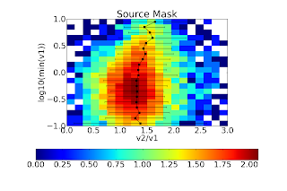
Source Mask "aperture":


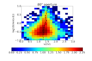
Same as above, but the best fit slope is steeper. The best explanation for the steeper slope (i.e., v2 > 1.5(v1)) is that more extended flux is recovered in v2 around bright sources, therefore in the larger source masks, there is greater flux than would be recovered if a simple 1.5x corrective factor was applied. 80" apertures


Same for 120" apertures:


For all 3 of the 40, 80 and 120" apertures both, the 1.5x correction factor is nearly perfect (agrees to <5%). The background subtraction seems to have different effects depending on aperture size. I welcome Erik to comment on this, but I do not think it is particularly important. The figures below require some explanation. NONE of the circular apertures use background subtraction in this comparison (i.e., compare to the RIGHT column above). These figures are histograms of the flux ratio within a given aperture as a function of flux in the v1 aperture. From bottom to top, the flux in the v1 aperture goes from 0.1 to 10 Jy. The X-axis shows the ratio of the v2 flux to the v1 flux. The black dots with error bars represent the best-fit gaussian distribution to each flux bin. The colorbar shows the log of the number of sources; the most in any bin is about 102.5 ~ 300. In short, there is some sign that the ratio of v2/v1 flux varies with v1 flux. This effect could be seen in the figures above since a linear fit is imperfect. The effect is not very strong. Again, I believe the explanation here is the changed spatial transfer function in v2.